Decorative brick is like a strong accent in styling – beautiful, but it requires company that will not drown it out. If after installation something is “missing” or on the contrary – there is “too much going on” in your interior, the problem usually lies not in the brick, but in the accessories. Below we have collected the furnishings that most often clash with it, and hints on what to replace them with. For the sake of order – separately living room, kitchen and bedroom, because in each zone the pitfalls are slightly different.
Living room: brick likes breath, doesn’t like competition
The most common mistake is “strong on strong.” A brick wall behind the TV, and next to it a glossy coffee table, a quilted sofa, a mirrored dresser and a dense gallery of frames. The effect? Chaos and heaviness.
What to avoid:
- Gloss and chrome on a large scale (“piano” fronts, mirrored furniture).
- Excessively patterned carpets (Moroccan arabesques, sharp contrasts) just under the brick – it begins to “ripple” in the eyes.
- Dense galleries of small pictures on the brick – the texture of the wall is a decoration anyway.
- Sofas with a strong gloss or in neon – brick is a warm and matte background.
Better substitutes:
- Matte wood (oiled), black or graphite painted steel, glass with a delicate frame.
- A flat-woven carpet in muted colors that organizes the space instead of playing first fiddle.
- One large graphic next to a brick wall instead of many small ones on it; possibly a shelf-layer with 2-3 frames.
Example of arrangement: brick wall behind TV + sofa in linen fabric (beige/sage), solid wood table on a simple steel frame, one floor lamp with fabric shade, carpet in a calm melange.
Kitchen: the structure is already on the wall – let the rest be the background
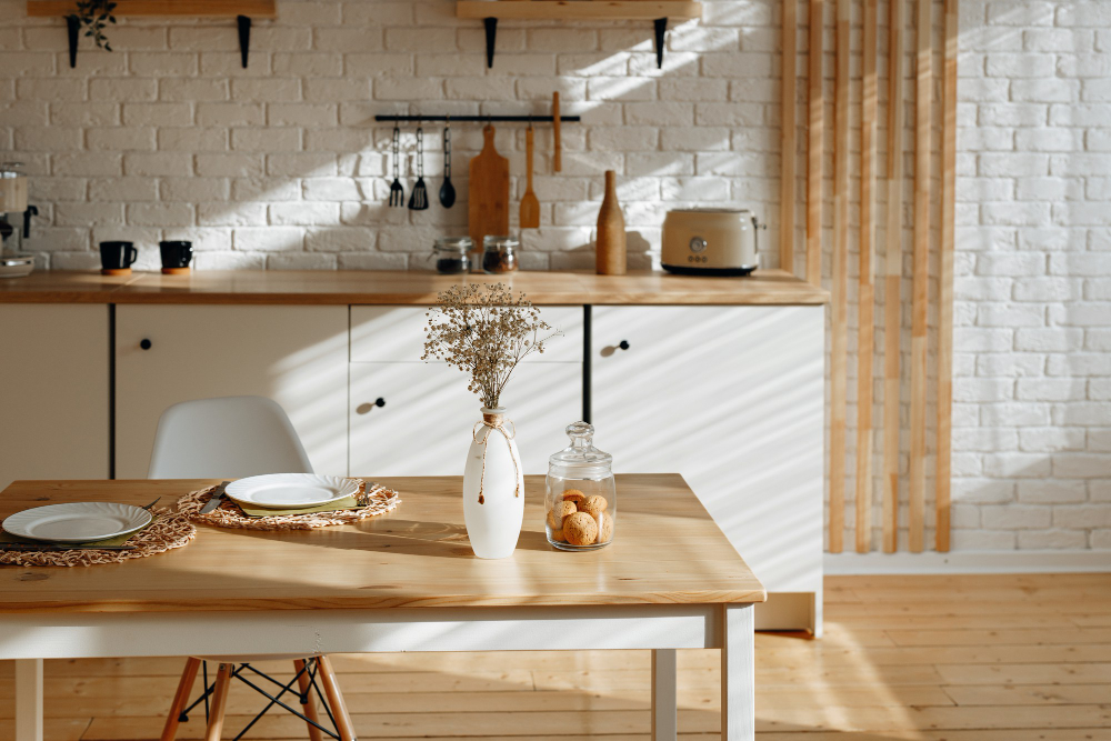
The kitchen is all about hygiene and legibility. Brick (especially whitewashed or in warm red) gives character, but is easily subdued.
What to avoid:
- High-gloss fronts in intense colors (red, maroon, navy blue) right next to the brick – they begin to compete with each other.
- Heavy fretwork and decorative handles (baroque, crystal) – a different stylistic language.
- Open shelves “from ceiling to countertop” with dozens of trinkets – the brick becomes a background for clutter.
- Cold, bare LEDs 4000-6000 K – bring out every irregularity of the wall, while cooling the color of the brick.
Better substitutes:
- Matte fronts in creams, beiges, with a simple handle; for the loft – graphite, but in moderation.
- A few closed cabinets + 1-2 thoughtful shelves (ceramics in similar tones, glass).
- Warm 2700-3000 K lighting with milk shades or under-cabinet blends.
Example of arrangement: a strip of brick between the countertop and upper cabinets (protected with matte impregnation), matte fronts in broken white, oak countertop, black simple handles, on the shelf three larger dishes instead of fifteen trinkets.
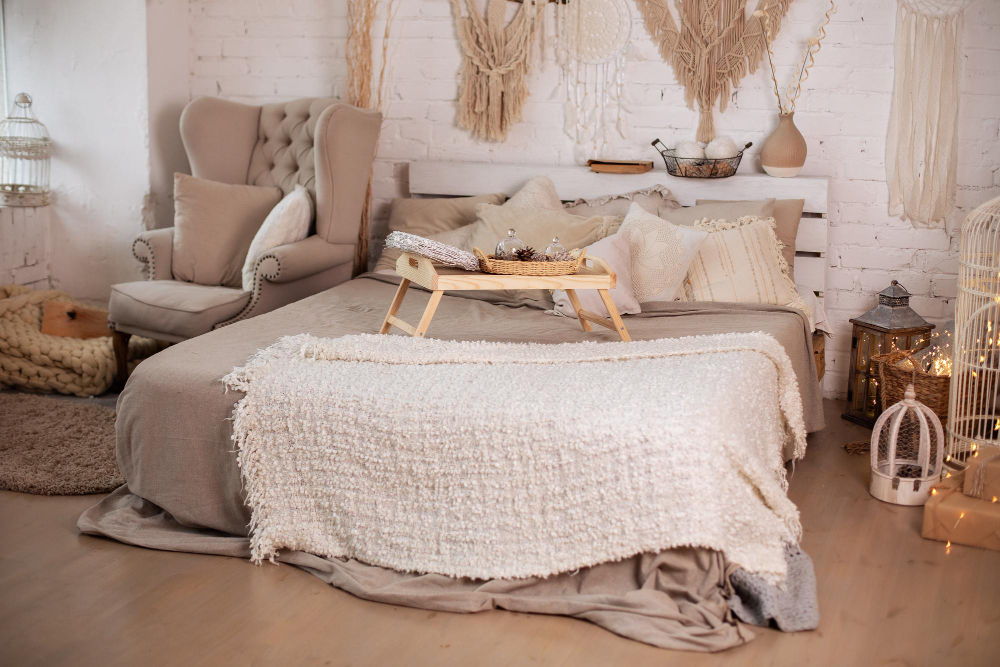
Bedroom: soothing instead of stimulating
Bedroom is a place of rest – if you installed in it old brick on the wall, it is easy to overdo it with accessories from “another fairy tale”.
What to avoid:
- Heavy glossy curtains, glamour velours, crystal lamps – they conflict with the porosity of the wall.
- Multicolored pillows and bedspreads (five patterns at a time) – the rhythm of the brick plus the multitude of prints gives an overly dense mix.
- Black glossy lacquered furniture next to whitewashed brick – too sharp a contrast.
Better substitutes:
- Linen, cotton, wool – soft, matte, in 2-3 tones.
- Wall lamps with fabric shades or porcelain fixtures; warm light.
- Headrest in wood or upholstered in natural fabric.
An example of an arrangement: a narrower strip of brick behind the bed, walls in ivory, plain bedding, a bedspread with a distinct weave, two decorative pillows in muted green, simple wood bedside tables.
Small things that spoil the effect (and how to fix them)
- Too many “inscriptions” and gadgets (neon signs, placards) – leave one clear accent, limit the rest.
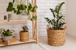
- Plastic imitations of nature (shiny rattan-like baskets, artificial “stone”) – next to brick look cheap; choose real wicker, ceramics, stoneware.
- Too few fabrics – brick likes soft “counterweights”: carpet, curtains, bedspread.
- Excessive black – one black detail organizes, full black fronts + black fixtures + black carpet can overwhelm.
Dot the … brick!
If you’re just planning on brick, and you’re worried about a heavy effect, consider whitewashed tiles cut from original demolition brick or warmer, sand-red tones with light grout. They give texture and history, but leave more light and freedom to choose accessories. In practice, it is then easier to build a cohesive interior – especially in smaller living rooms, kitchens open to the room and quiet bedrooms.
Our store offers both whitewashed cut tiles and classic shades of recycled bricks – The choice of tone and grout really makes a difference, and the rest of the accessories begin to fall into place on their own.