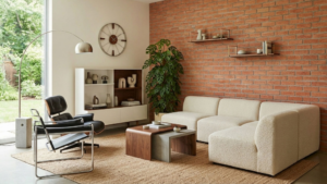
Japandi combines Scandinavian simplicity with the Japanese love of quiet and craftsmanship. The background is tranquil, the materials are real, and the form is devoid of unnecessary embellishments. Brick is sometimes a surprise here, but in the right setting it can fit perfectly into the narrative: it brings subtle texture and warmth without taking away from the interior’s breath. The key is the choice of shade, scale and connections.
What kind of brick harmonizes with the japanese style?
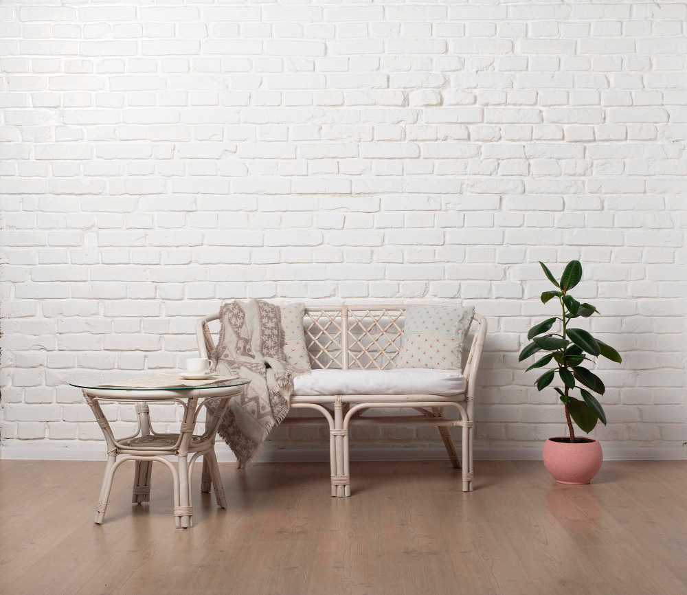
Lightened versions work best: whitewashed brick with subtle rubbing, or sandy-red tones that do not fall into intense red. Such a palette will not dominate light walls and natural wood.
The effect is equally determined by the grout: linen or cream-colored grout ties the whole thing together and calms the rhythm, while dark grout leads toward industrial.
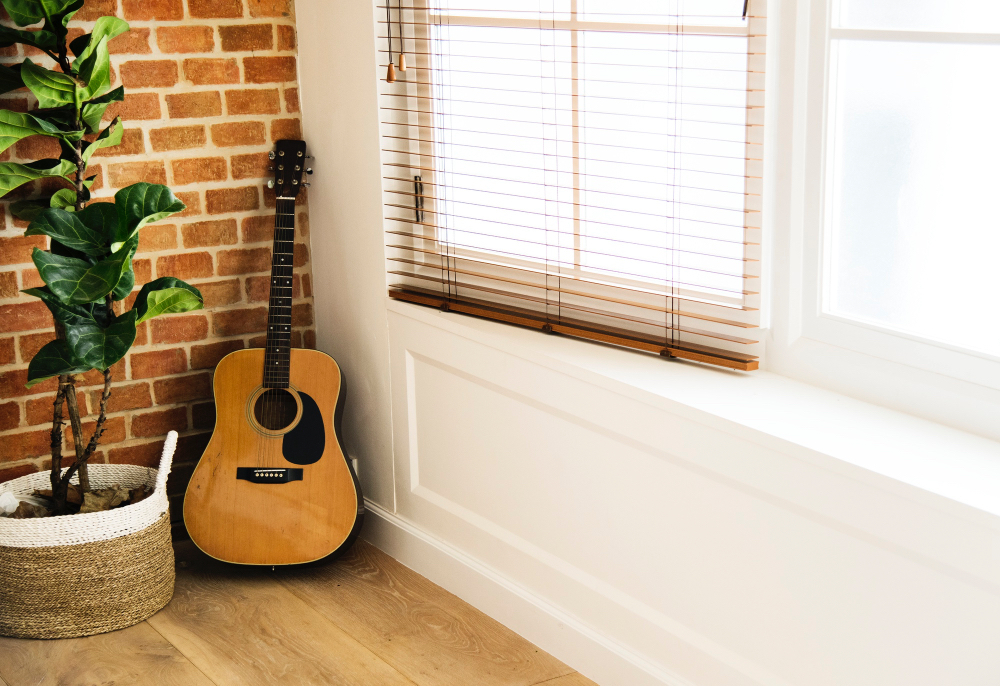
If the interior is small, bet on brick tiles made of real old brick – give an authentic texture with less thickness, making it easier to install without “eating” centimeters.
Where to put the brick so as not to disturb the proportions?
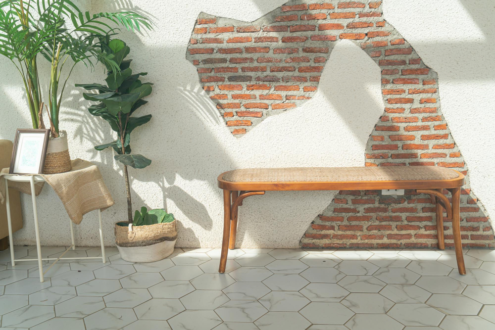
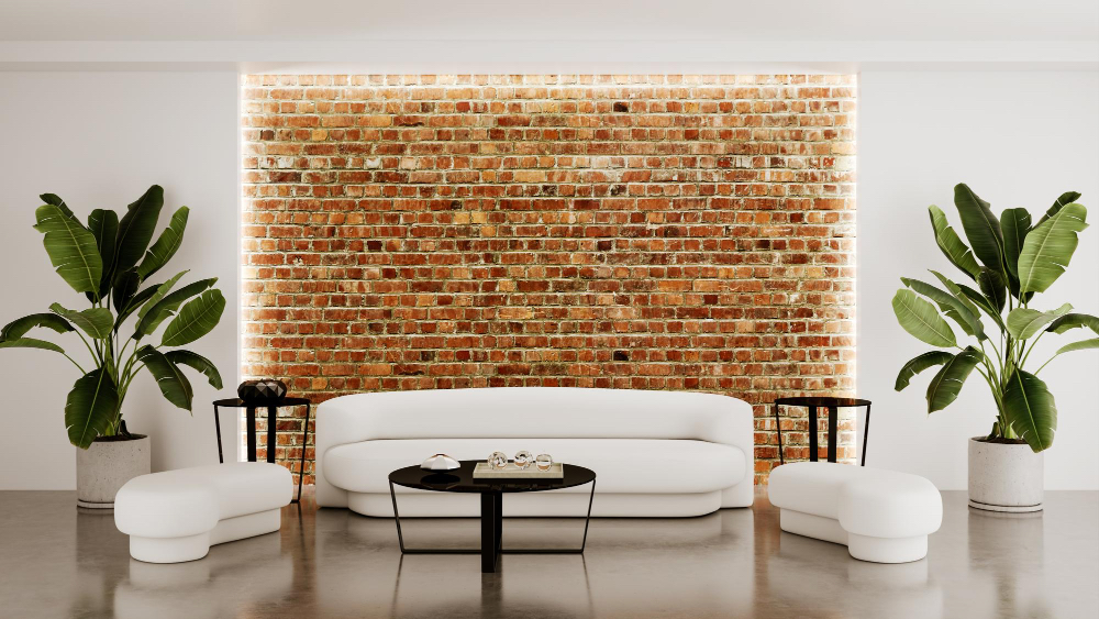
In japanning, restraint is what counts. Brick will play best in one clearly defined place: behind a low dresser, in a shallow alcove, as a belt at the dining room table, or a narrow lamppost in the hallway.
In the bedroom, a headboard made of a narrower strip of brick works nicely with plain cotton bedding and a paper lamp, and in the kitchen, a section between the countertop and the shelf is enough to warm up the plain veneer fronts.
Instead of covering entire walls, let the material become one quiet accent.
Wall colors and balance
Japandi requires a base that does not compete with the materials. Broken whites, warm grays and bleached beiges will build a background for brick and wood. If you want to add an accent of color, bet on sage or dove blue – in a small area (for example, in an alcove) or in the form of textiles.
It is important that the rest of the planes remain uniform – this way the brick remains a structural element, rather than a decorative wallpaper.
How to choose accessories: wood, fabrics, ceramics
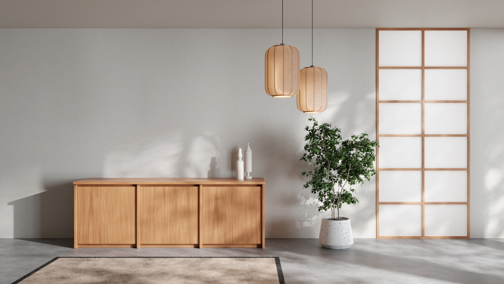
Brick in a bleached or sandy version like warm, light wood – oiled oak, ash, bamboo. Instead of gloss, choose matte or silky semi-matte finishes; light is supposed to glide across them, not reflect like in a mirror.
Let fabrics be soft to the touch, but visually calm: linen, thicker cotton, wool in melange. Porcelain and stoneware can have an irregular edge, but in one muted tone. When a pattern appears, let it be rhythmic and fine – overly decorative prints will ruin the composition.
Light that draws structure
Brick takes on depth when the light falls diagonally. Instead of a single, strong ceiling lamp, two-three sources of warm color, arranged so that they softly “stroke” the texture of the brickwork, work better.
Milky shades, paper lamps or wooden fixtures keep things soft. In the kitchen, a strip of under-cabinet lighting with a milky shade will bring out the brick without sharp contrasts.
Practice and care
In areas exposed to touch and dirt (corridor, dining room), the brick should be protected with a matte vapor-permeable impregnator, which makes it easier to clean without adding gloss. In the bedroom or study, gentle vacuuming and occasional wiping with a damp cloth will suffice.
In a japanese style interior, the following will work best our white brick tiles (in whitewashed, sand and apple shades). They add authenticity and natural texture, and the light grout maintains the calm rhythm that this style needs.