Decorative brick has been one of the strongest trends in interiors for years. It gives character, introduces texture and can completely change the perception of a space.
At the same time, it is a material that is merciless to design mistakes – a bad choice stays in the apartment for years and instead of a loft effect there is chaos or the impression of cheap styling.
So let’s check, the most common mistakes made when choosing a decorative brick and how to avoid them in practice.
1. selection of brick by color only, without considering texture and light
The most common mistake starts in the store or when browsing photos on the Internet. The decision is made on the basis of color – “this red one is pretty” or “this white one goes with everything”.
The problem is that color is only one of the elements, and often not the most important at all. Brick works primarily with texture, and texture responds to light.

A smooth clinker brick will reflect light quite differently from a hand-formed brick with deep pores.
In a small, poorly lit living room, a massive, dark brick with a sharp texture can “take away” space instead of emphasizing it. In contrast, the same brick in a loft with large windows will look noble and austere.
The mistake is to ignore daylight and artificial light exposure. A brick viewed in a store under neutral lighting often looks quite different when installed in a home.
It is always a good idea to test a sample in the target interior – in the morning, in the evening and with the lamps on.
2. excess brick in one interior
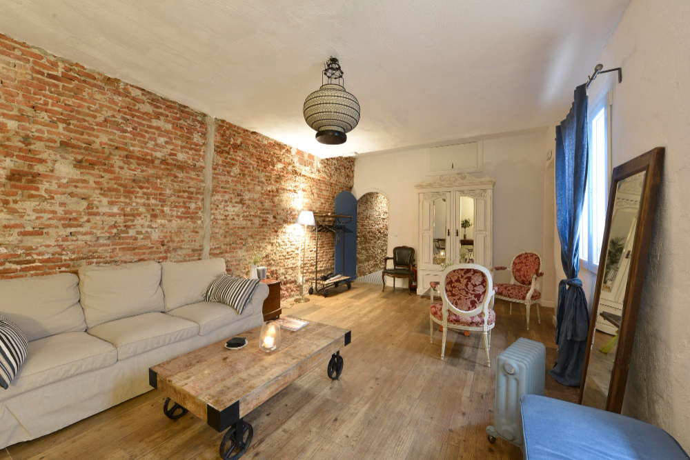
Brick has a strong visual character. It is not paint or smoothness that can provide a backdrop. One of the classic mistakes is the belief that since brick looks good on one wall, it will look even better on three. In practice, the effect is sometimes the opposite.
Too much brick causes visual fatigue. The interior becomes heavy, monotonous and begins to resemble a stylized basement or themed restaurant.

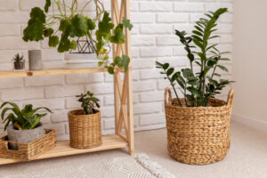
Brick works best as an accent. One wall in the living room, a section in the kitchen, an alcove or a belt near the stairs.
The rest of the surface should balance it – with smooth walls, calm colors and materials with less texture. It is contrast that builds the effect, not excess.
If you dream of a brick wall – here you will order original bricks, coming from demolition of buildings even from 100 years ago!
3. mixing styles without consistency checks
Brick is a material with strong stylistic roots. Raw, irregular brick is associated with industrial, loft, rustic or post-industrial style.
One of the most serious mistakes is combining such brick with very shiny, ultra-modern elements without any style bridge.
An example is the juxtaposition of aged brick with high-gloss lacquered furniture, chrome accessories and cold LED lighting.
Each of these elements separately can be good, but together they create a visual conflict. The interior then looks haphazard, inconsistent and tiresome.
If you want a modern brick interior, choose a brick with a calmer texture, more uniform in color.
If the brick is heavily rustic, the rest of the interior should be subdued, matte and economical in form.
Style is not about mixing everything with everything, but about conscious decisions.
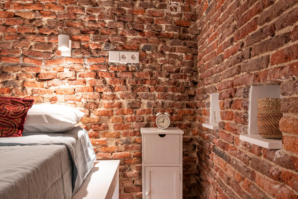
4. wrong choice of grout color
Grout is a detail that many builders treat neglectfully. This is a mistake, because grout greatly affects the final effect of a brick wall. It can either accentuate it or spoil it completely. The most common problem is too much contrast between the brick and the grout.
Light grout next to dark brick creates a strong grid that dominates the material. In small rooms this can overwhelm and optically “cut” the wall.
In contrast, very dark grout next to light-colored brick can look unnatural and dirty, especially with uneven edges.

A safe rule of thumb is to choose a grout that is tonally similar to the brick, but not identical. Soft contrast is desirable, sharp contrast is rare.
It is also worth paying attention to the texture of the grout itself. Smooth, even grout will change the character of the brick to a more modern one, while slightly uneven grout will emphasize its rawness.
5. lack of thinking about the long-term effect
The last but very important mistake is to make decisions under the influence of a fad or a photo from the Internet.
Decorative brick is a permanent element that is difficult to change quickly. What seems striking today may be tiresome in a few years.
It is worth asking yourself whether a particular brick will still fit into the interior after changing the furniture, lighting or wall color.
The best realizations are those in which the brick is a neutral but distinctive background, rather than the main actor playing first fiddle.
The conscious choice of brick is a combination of aesthetics, functionality and moderation. By avoiding the mistakes described above, you can create an interior that is cohesive, timeless and really well designed.