When choosing a decorative brick, most people focus on the shade and texture of the tiles. Meanwhile, the final appearance of the wall depends to a huge extent on … grout. It is it that can make the wall look like an authentic wall from an old tenement or, on the contrary, like a modern, orderly decoration.
The same set of tiles can give a completely different effect depending on the color of the grout. That’s why it’s worth thinking carefully about the decision even before installation, because after grouting a change is already practically impossible without dismantling the wall.
Why does grout matter so much?
Brick has a clear structure and irregular edges. The grout fills the space between the tiles, but at the same time creates the “drawing of the wall”. It is she who decides:
-
Whether the wall will be calm and uniform,
-
Whether strongly contrasting and decorative,
-
Whether more rustic or modern.
It can be said that tiles are the material and grout is the style.
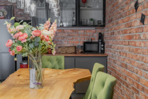
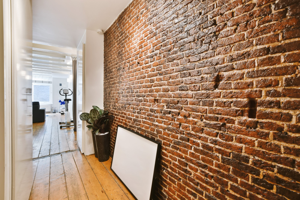
White grout – old townhouse and loft effect
This is the most commonly chosen option, and for good reason. The white grout strongly emphasizes the shape of the bricks, making the wall look like a classic structural wall.
What the effect looks like:
-
Individual bricks are visible,
-
a strong contrast is created,
-
The wall becomes the main decoration of the interior.
Where it will work:
-
living room behind the sofa,
-
TV wall,
-
loft-style kitchen,
-
Townhouse apartments and industrial style.
White grout looks especially good with classic red demolition brick. It emphasizes its shape and gives the impression of authentic masonry rather than cladding.
Minuses:
-
It gets dirty faster (especially in the kitchen or hallway),
-
requires thorough grouting and cleaning after installation.
Grey grout – the most versatile solution
Gray grout is a compromise between contrast and tranquility. It doesn’t draw as much attention as white, but still highlights the brick nicely.
Visual effect:
-
The wall looks natural,
-
The bricks are visible, but not dominant,
-
The interior is more modern and orderly.
Where best:
-
corridor and hallway,
-
kitchen,
-
dining room,
-
Modern and Scandinavian apartments.
Gray grout masks dirt well and is most practical for daily use.
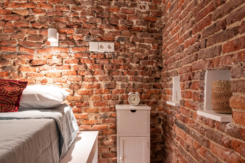
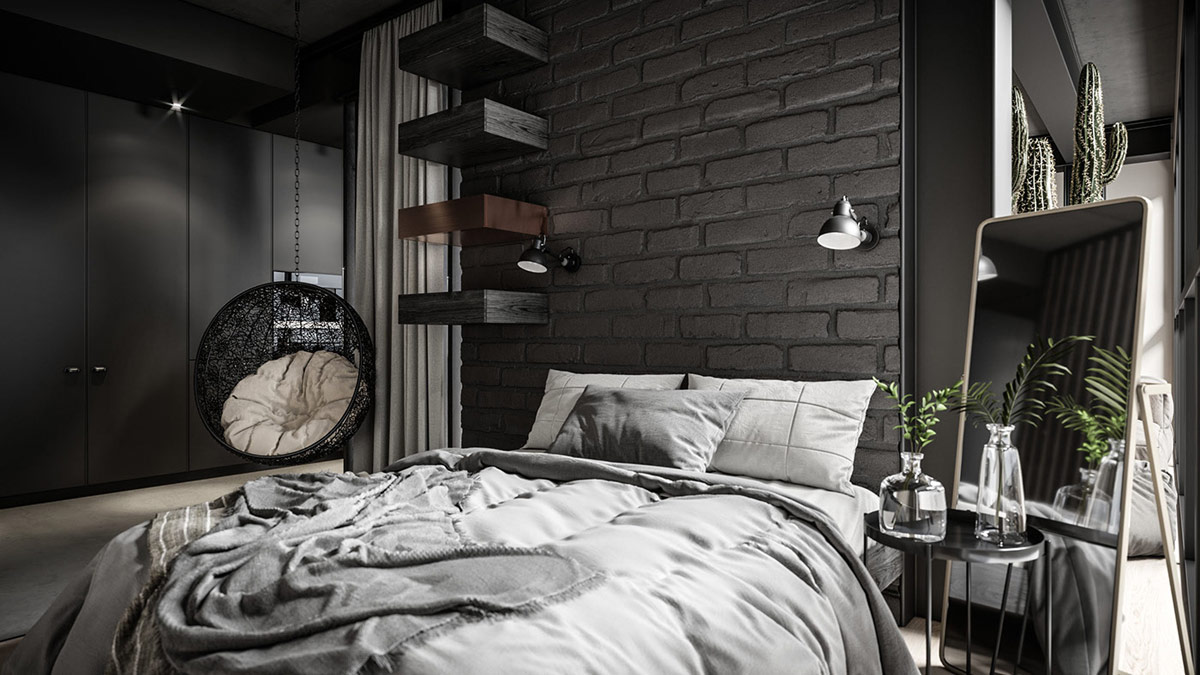
Brick-colored grout – a calm and elegant wall
This is a solution chosen less often, but very impressive. Grout color-matched to the brick makes the wall look like a uniform surface.
Effect:
-
The bricks “blend” together,
-
The wall is visually calm,
-
The interior looks more elegant and modern.
Where it fits:
-
bedroom,
-
minimalist interiors,
-
Small rooms (visually less going on the wall).
This is a good solution if the brick is to be the background and not the main decoration.
How to choose grout step by step
-
Choose the brick first – the color of the grout matches the tiles, not the other way around.
-
Think about the effect – whether the wall should dominate or be subtle.
-
Consider the room – darker grout is more practical in kitchens and hallways.
-
Do a trial run – it’s best to lay a few tiles and grout a section on a sample of drywall or board.
In pictures on the Internet, grout often looks different than it does in reality – especially in artificial lighting.
Grout width also matters
Not only the color, but also the width of the joint affects the end result.
-
8-10 mm – old masonry effect (most natural)
-
5-7 mm – a more structured look
-
3-4 mm – modern decorative wall
Wider joints are best suited for demolition bricks, as they correspond to actual masonry.
A common mistake: grout as for ceramic tiles
Brick is not stoneware. Using thin grout and smooth, very hard grout makes the wall look artificial. The best effect comes from grout with a slightly rough texture that resembles mortar.